Client
Nowhere Good Diner
(Personal Project)
Year
2025
SCOPE
Visual / Brand identity
Color system
Typography
Menu design
Merchandise exploration
Something Good, in The Middle of Nowhere
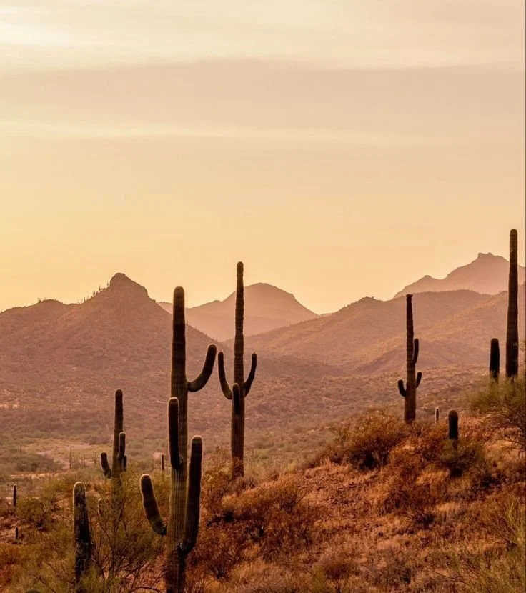
Nowhere Good is a conceptual late-night diner located in the desert valley of Marble Canyon, Arizona. Designed as a quiet pit stop for cross-country night drives and rural locals, the brand centers on comfort, reliability, and familiarity—offering a sense of calm in an otherwise isolated landscape.
The Challenge:
The objective was to design an identity for an established, mom-and-pop diner that feels lived-in rather than trendy. The brand needed to communicate trust, consistency, and warmth while reflecting the surrounding Arizona desert environment.
This project focused on translating place and atmosphere into a cohesive visual system. I explored Arizona’s natural color palette and developed a typographic and branding approach that could extend across menus, merchandise, and in-diner touchpoints. The challenge was to tell the diner’s story through design alone—without relying on excessive explanation or novelty.
Solution:
I created a visual identity that balances loneliness and comfort, reflecting a diner with limited foot traffic but strong character. The system uses restrained color, sturdy typography, and simple layouts to evoke familiarity and reliability.
Design decisions were guided by one central question:
If I were driving through the desert late at night, what would make this diner feel safe, inviting, and worth stopping for?
The final outcome is a flexible brand system that feels grounded, nostalgic, and intentional—demonstrating how thoughtful color, typography, and restraint can communicate story, place, and values.
Naming & Visual Identity
Meet the brand
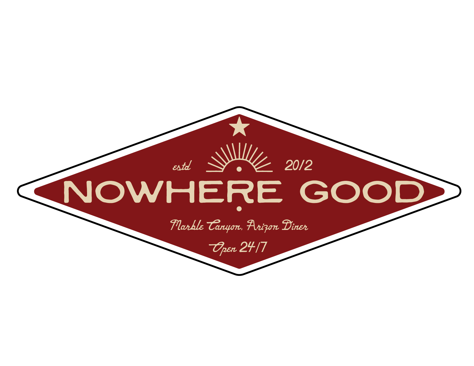
With the brand purpose established, I developed the name and visual identity to reflect the diner’s character and environment. The name, Nowhere Good, draws from the vast emptiness of the Arizona desert—an ironic nod to finding value and comfort in the middle of nowhere.
The visual identity was crafted to feel homemade and approachable, with bold, intentional use of Arizona-inspired colors and typography. The goal was a system that feels simple, strong, and grounded—something that communicates warmth and reliability while embracing the desert’s openness.
Secondary
Secondary


