❋
Nowhere Good
Nowhere Good
Conceptual Brand Identity
Client
Self-Initiated Project
Scope
Creative Direction
Brand Identity Design
Visual System Development
Print & Environmental Applications
Year
2025
Credits
Brand Design & Art Direction — Deja Brown
Something Good, in the Middle of Nowhere
Overview
Nowhere Good is a conceptual late-night diner located in Marble Canyon, Arizona. Designed as a quiet stop for cross-country night drivers and local regulars, the brand centers on comfort, familiarity, and reliability—offering a sense of calm within an isolated desert landscape. The goal was to create an identity that feels established and lived-in rather than trendy, reflecting the character of a mom-and-pop diner that has earned trust over time.
The Challenge
Design an identity for a rural diner with limited foot traffic but strong character—one that communicates safety, warmth, and consistency without relying on novelty or explanation.
The brand needed to:
Feel familiar, not designed
Reflect the Arizona desert environment
Extend naturally across menus, merchandise, and in-diner touchpoints
Tell its story visually, without overt narrative or marketing language
Concept
The brand was guided by a single question: If I were driving through the desert late at night, what would make this diner feel safe and worth stopping for?
Rather than creating a destination, the identity positions Nowhere Good as a reliable presence—a place that’s simply there when you need it.
Design Approach/Meet the brand
The visual system balances loneliness and comfort through restraint.
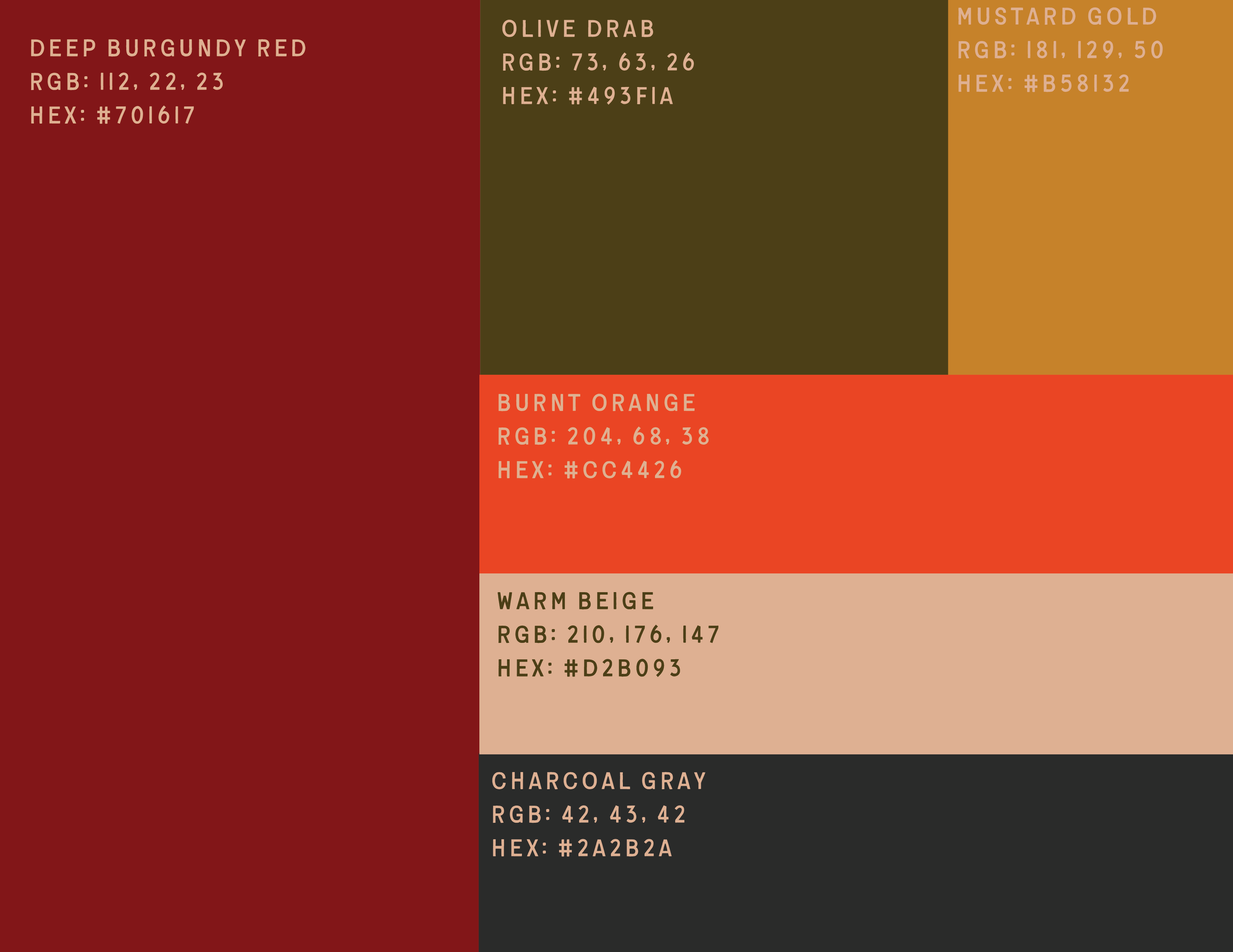
Color draws from the desert landscape: muted reds, warm neutrals, and off-whites that feel sun-worn rather than polished.
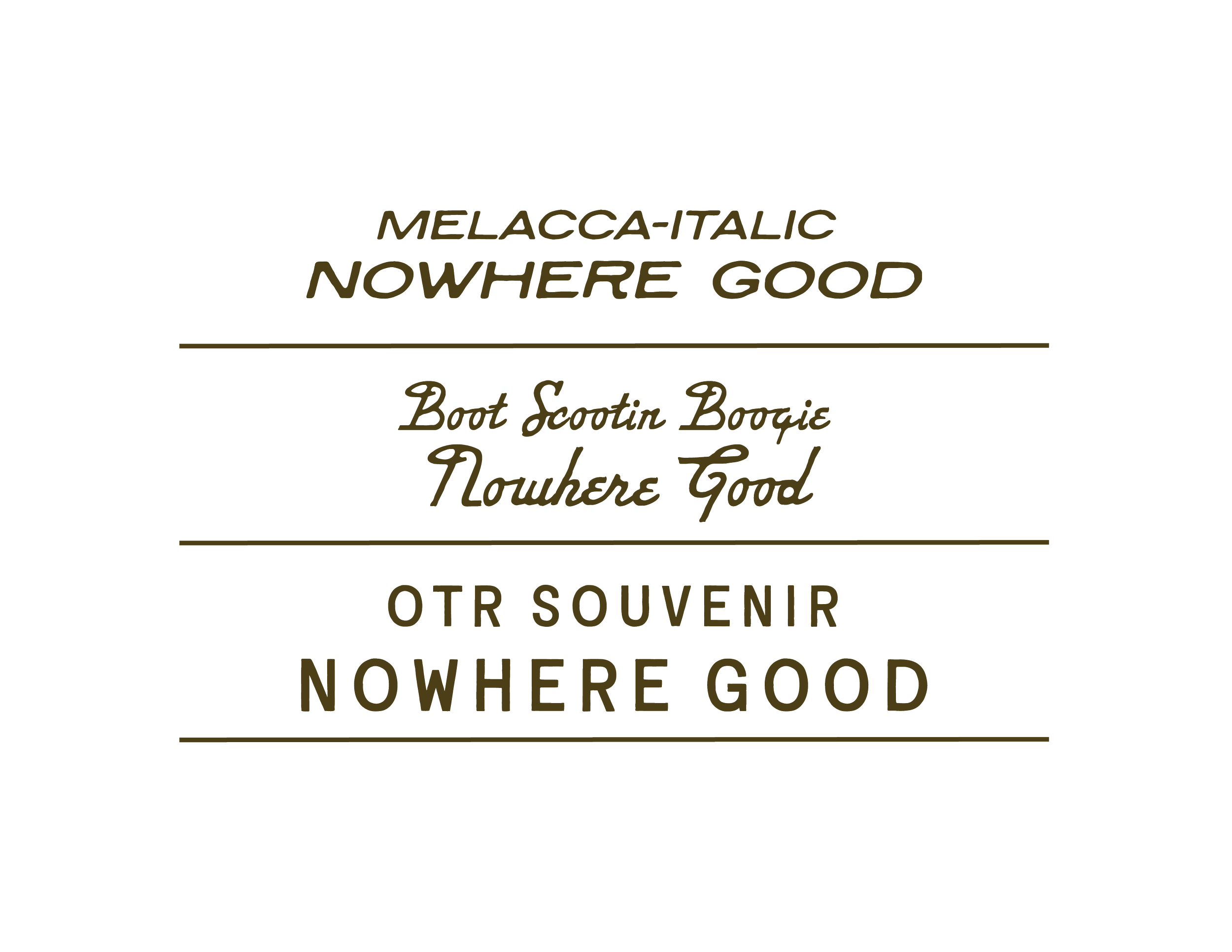
Typography is sturdy and legible, prioritizing clarity over expression.
Layouts are simple and functional, echoing classic diner ephemera.
Imperfections—wear, fading, and quiet inconsistencies—were intentionally created to suggest longevity.
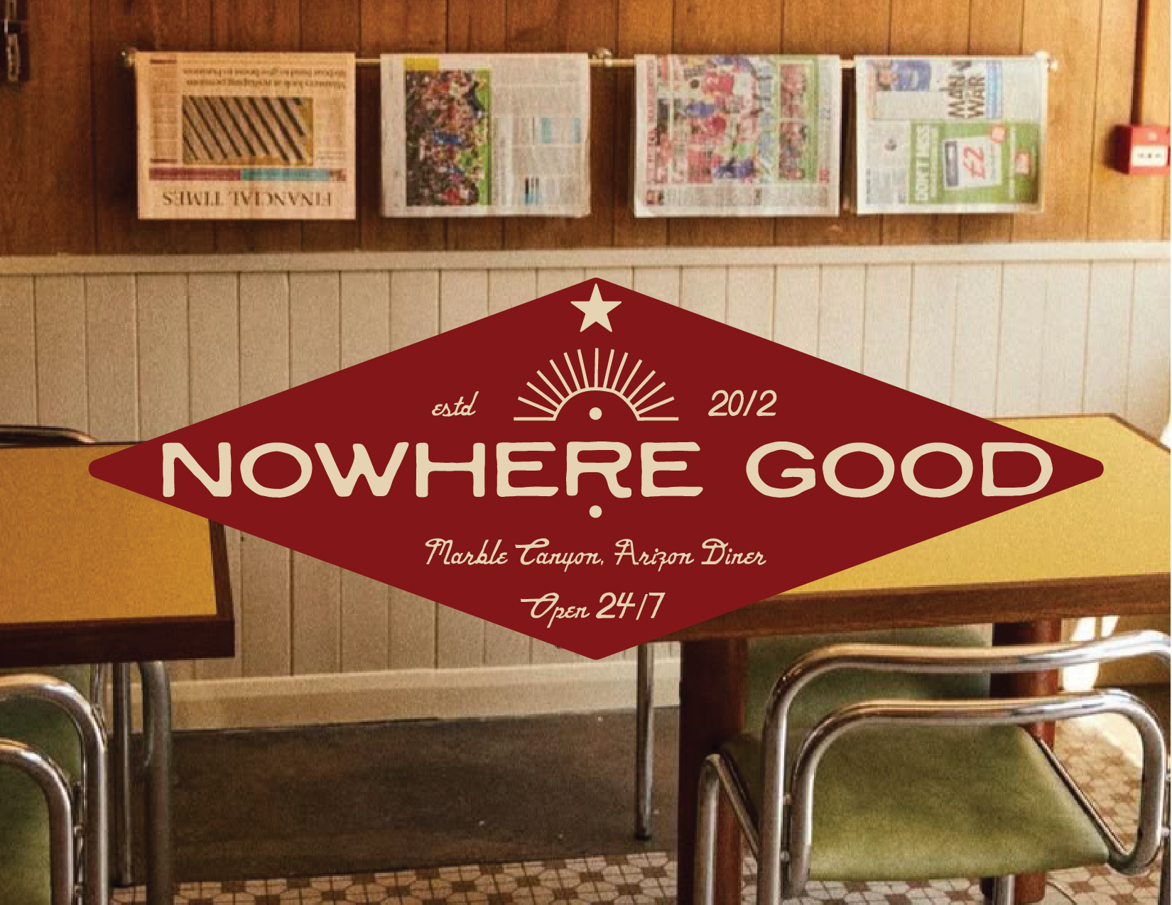
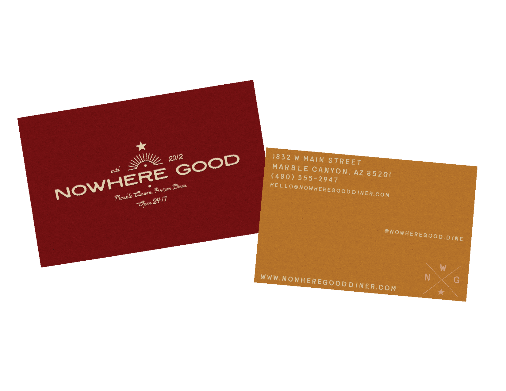
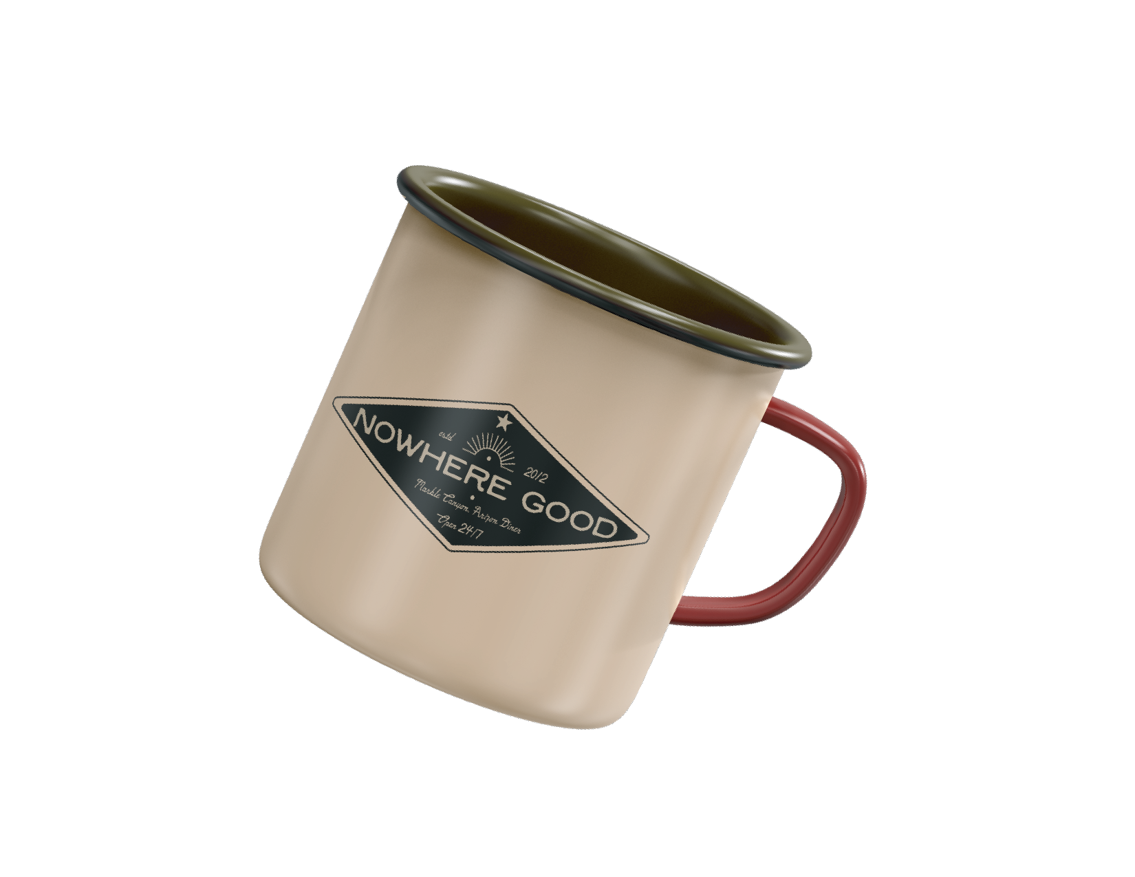
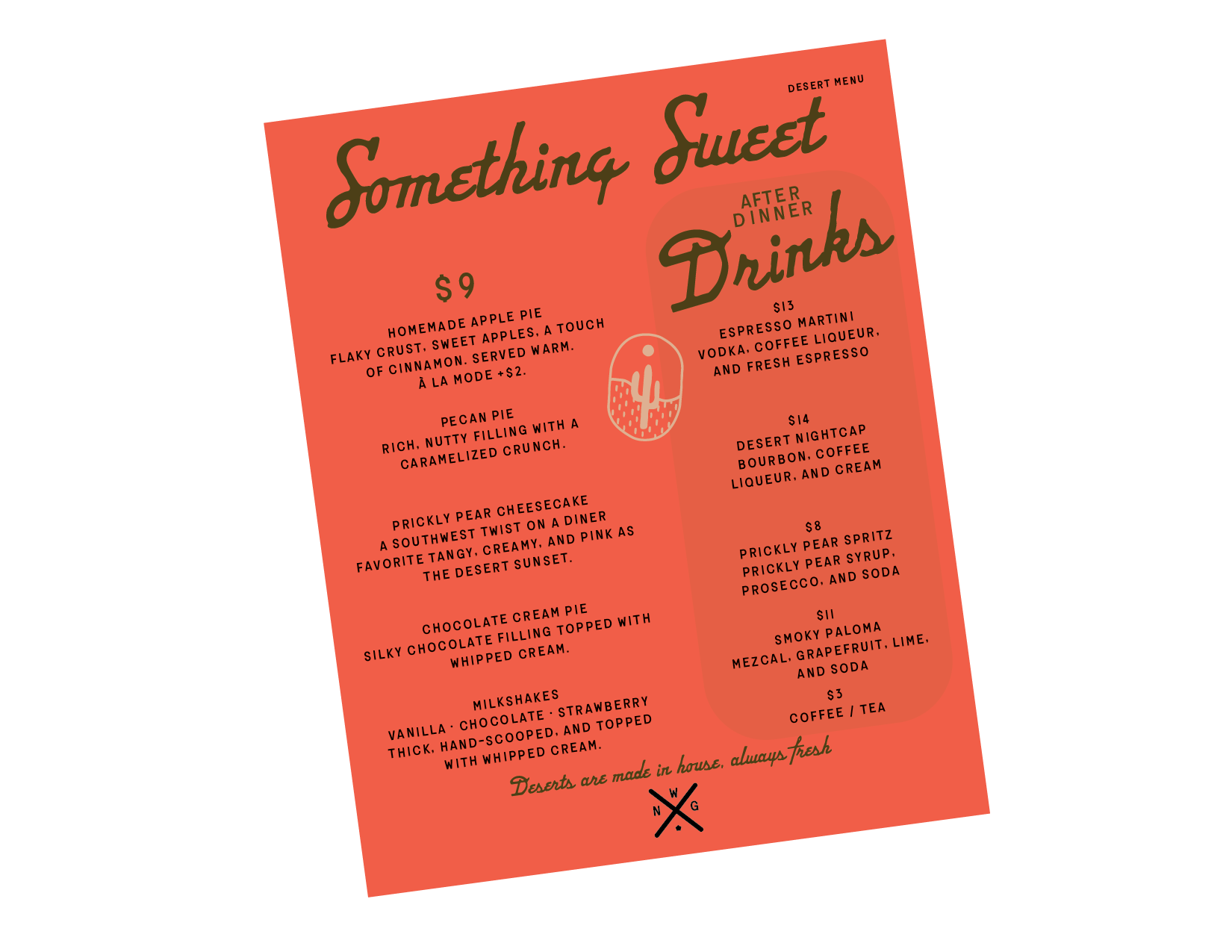
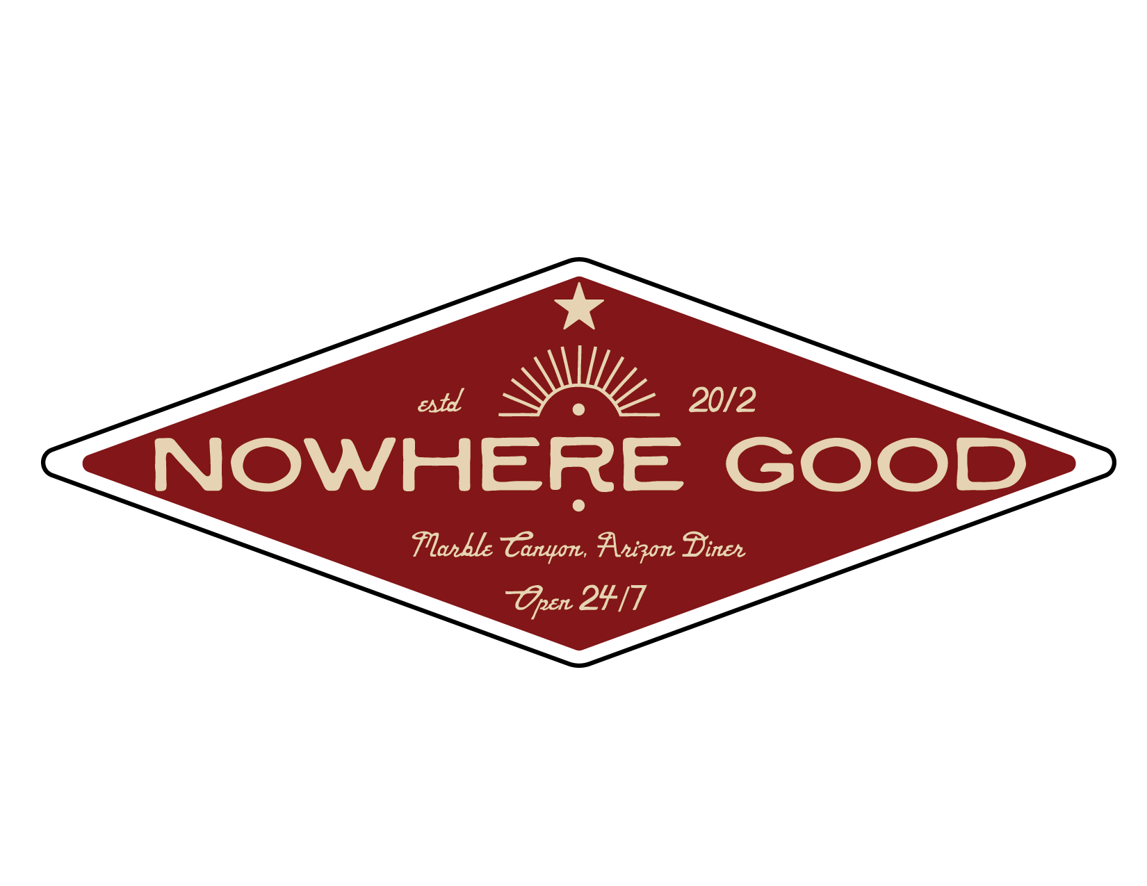
Identity System
The logo system was designed to adapt across environments, from signage to menus to window decals.
Supporting graphics and patterns remain minimal, allowing the brand to exist comfortably within its surroundings rather than compete with them.
Secondary
Color Pallette
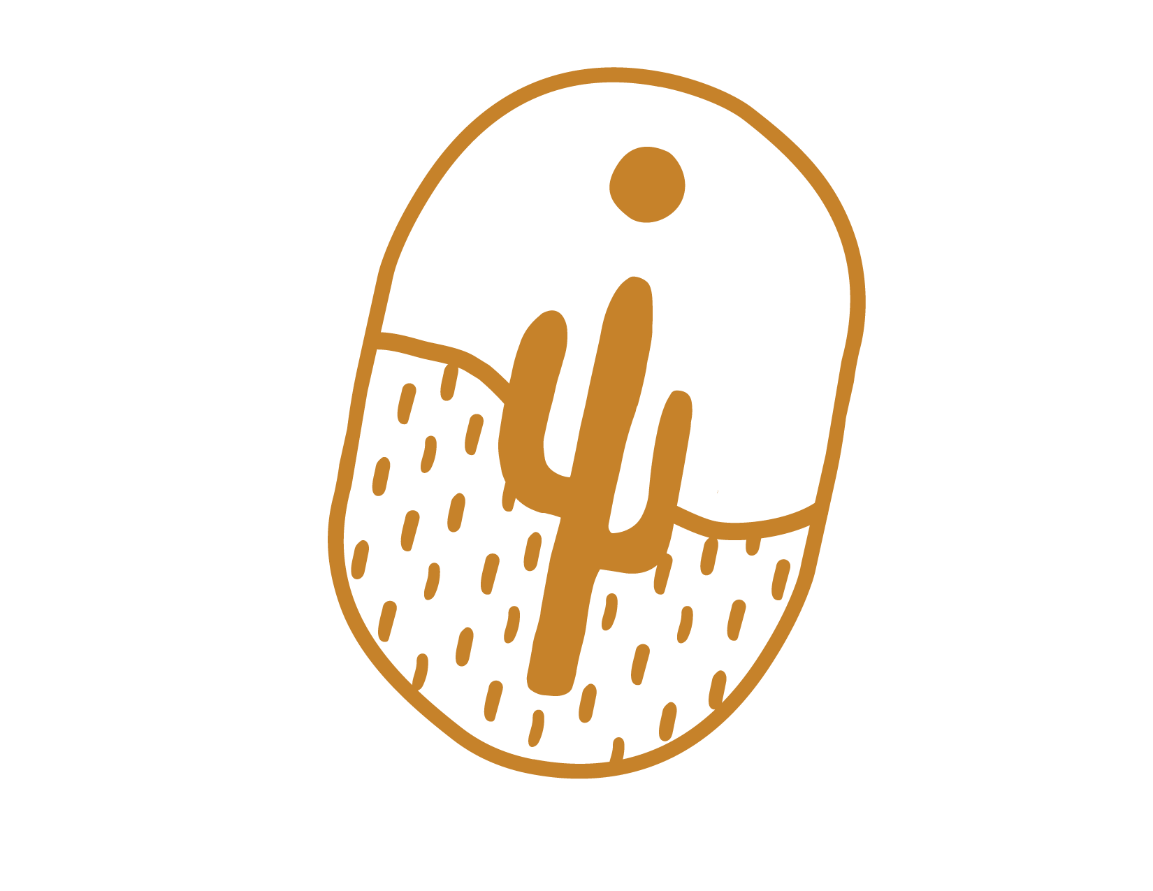
Brand Icons
To further drive home the story of creative content rooted in research, we developed a unique illustration style of abstract and vivid data visualizations.

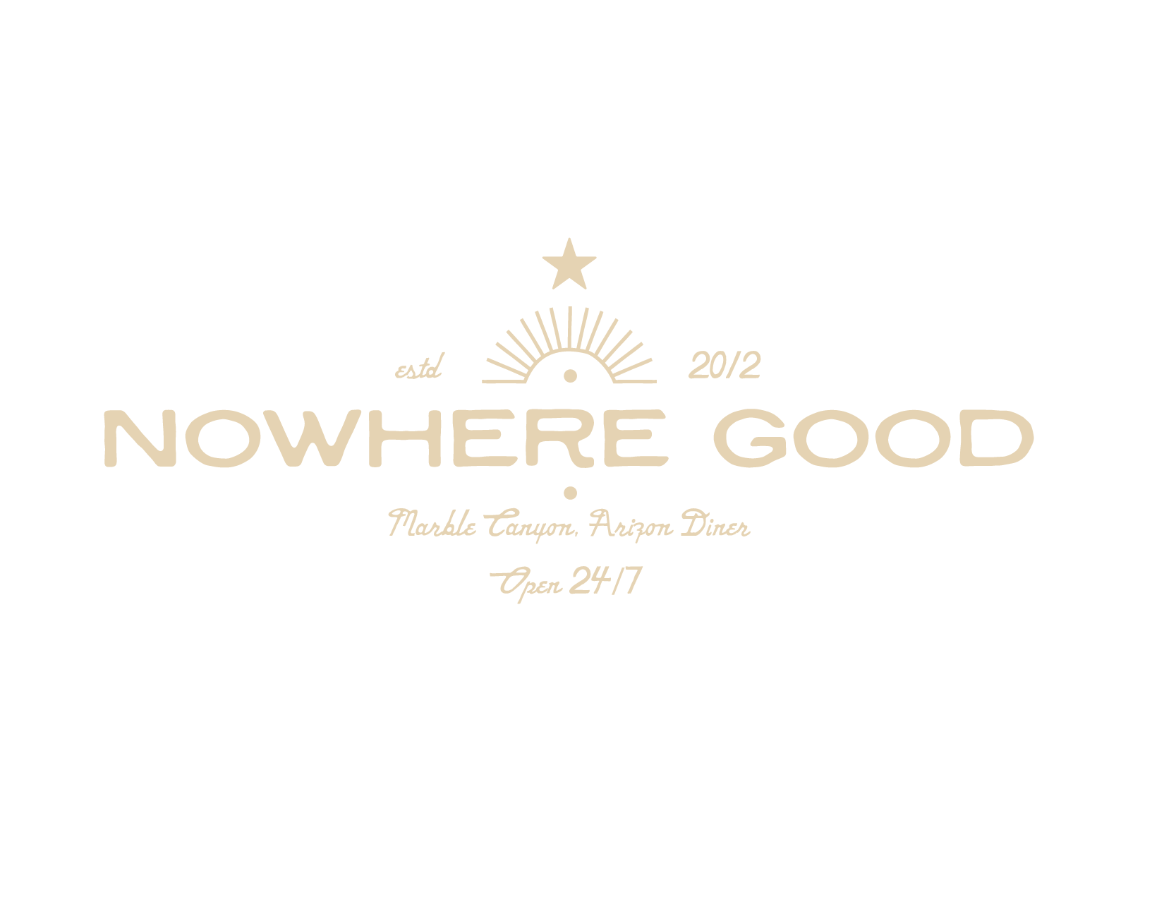
Mark
TYPOGRAPHY

The color palette is rooted in earth, wear, and utility. Rather than relying on high-contrast or trend-driven color, the palette draws from materials that feel used, weathered, and familiar—leather, rusted metal, soil, dust, and asphalt.
Outcome
The final system presents Nowhere Good as a grounded, familiar diner—one that feels trustworthy not because it tries to, but because it doesn’t have to.
The project demonstrates how restraint, atmosphere, and thoughtful typography can communicate place and values without overt storytelling.
Nowhere Good isn’t a destination. It’s a relief.
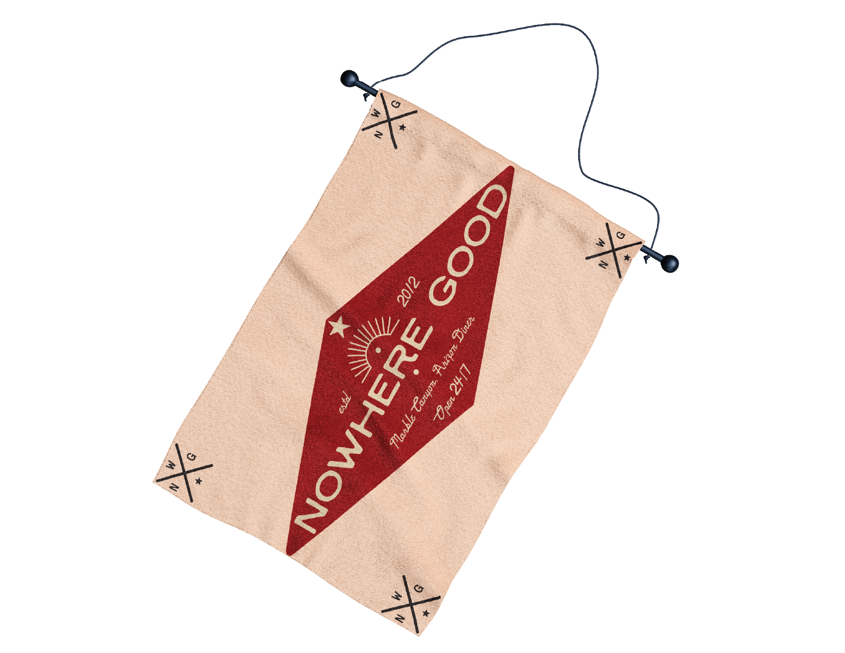
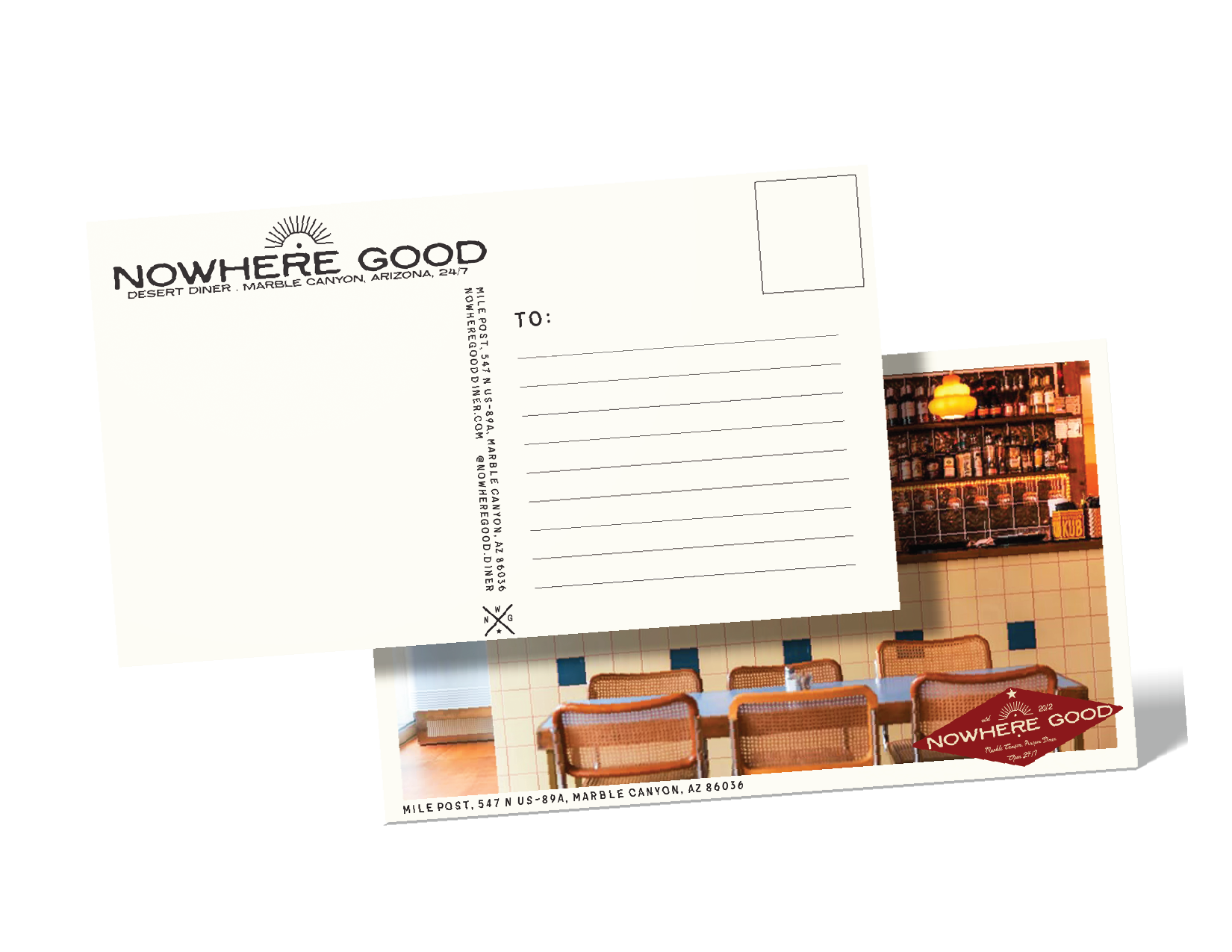
Applications:The identity extends across:
Menus and printed ephemera
Exterior and interior signage
Merchandise designed to feel incidental rather than retail-focused
Environmental moments that show the brand in use, at night, over time
Each application reinforces the same idea: consistency, warmth, and quiet reliability.

Primary