❋
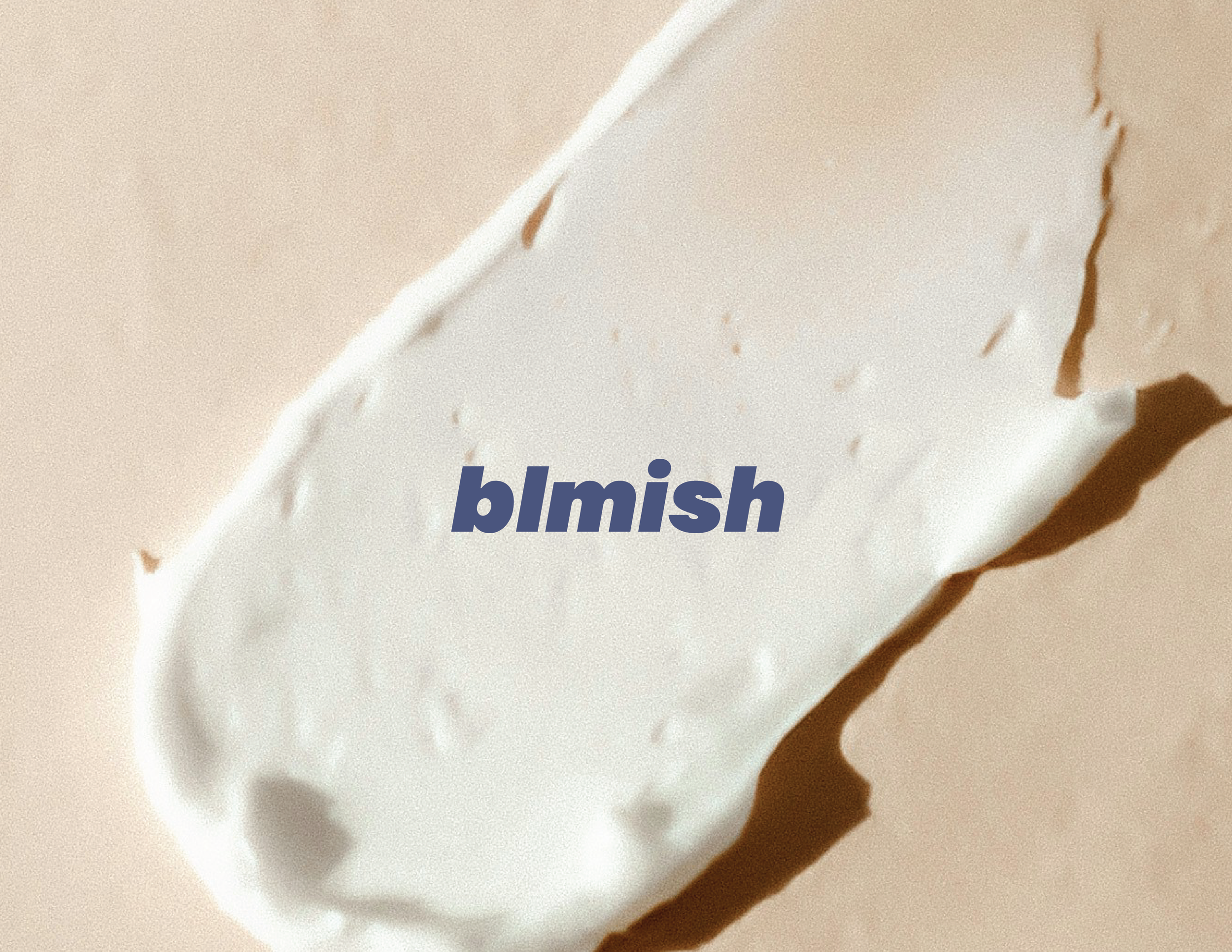
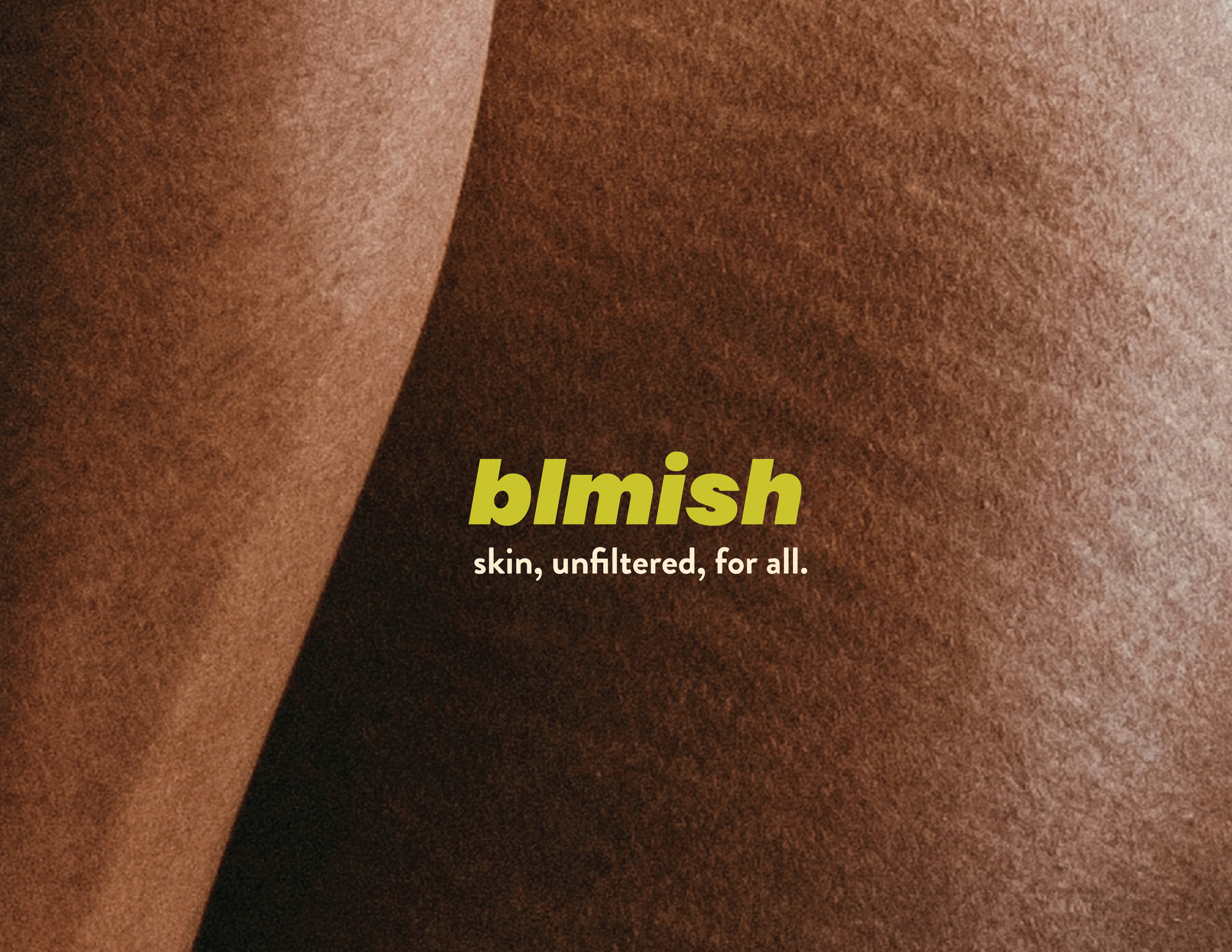
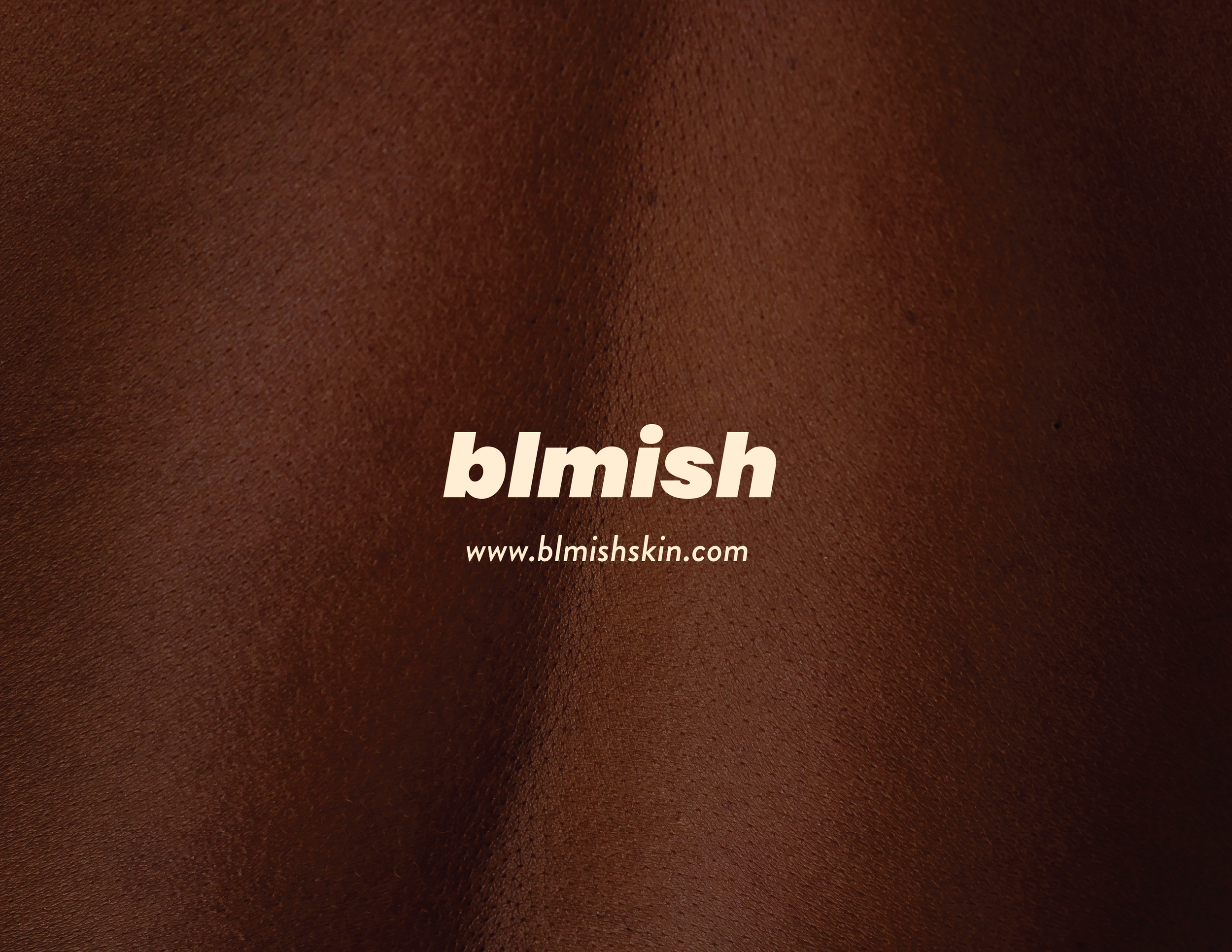
BLMISH SKINCARE
Client
Conceptual Brand Identity
My Scope
Art Direction
Brand Design
Visual Identity
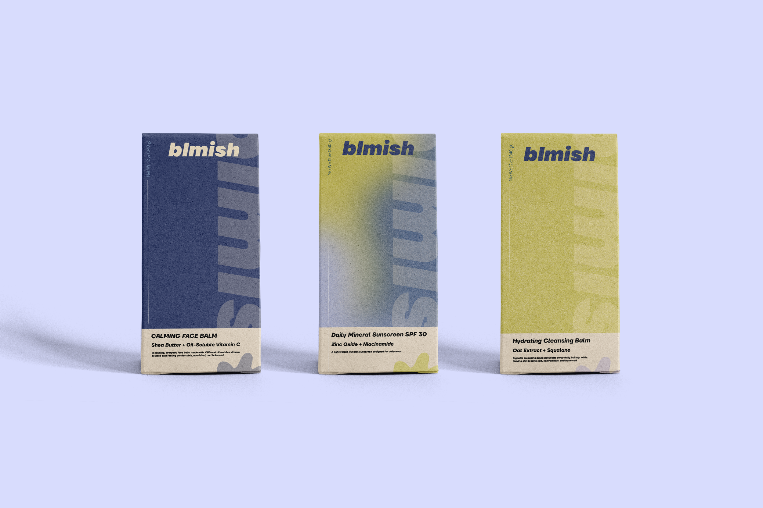
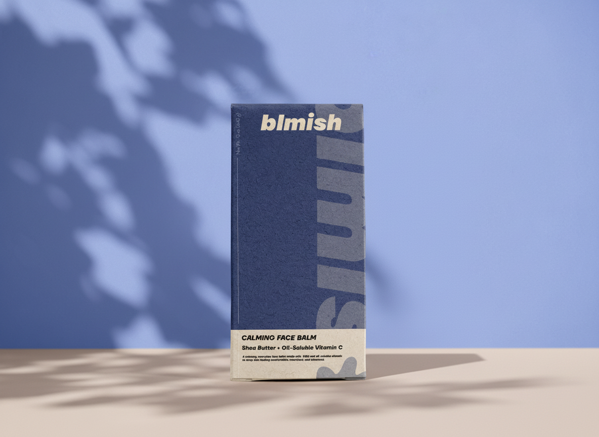
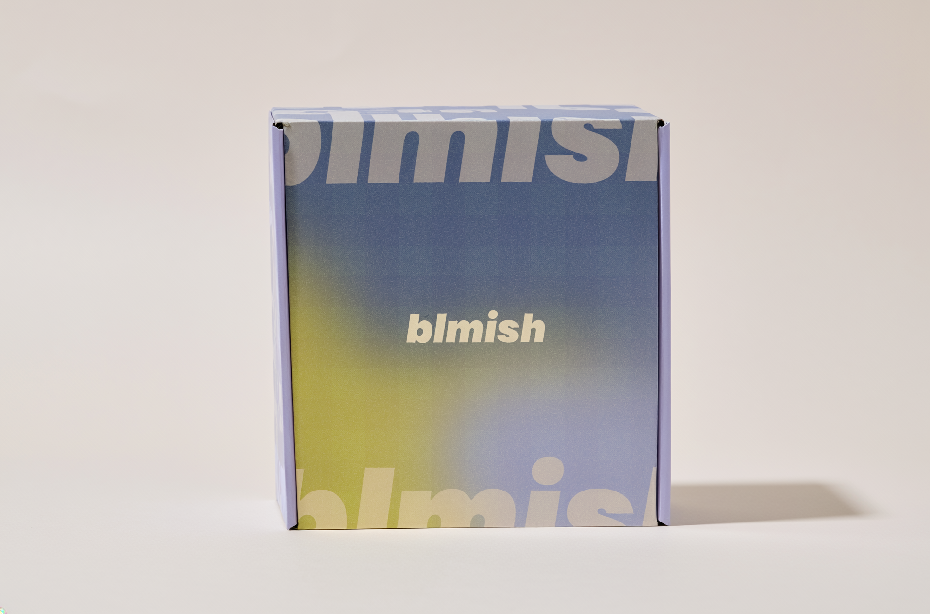
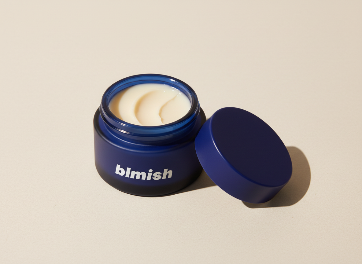
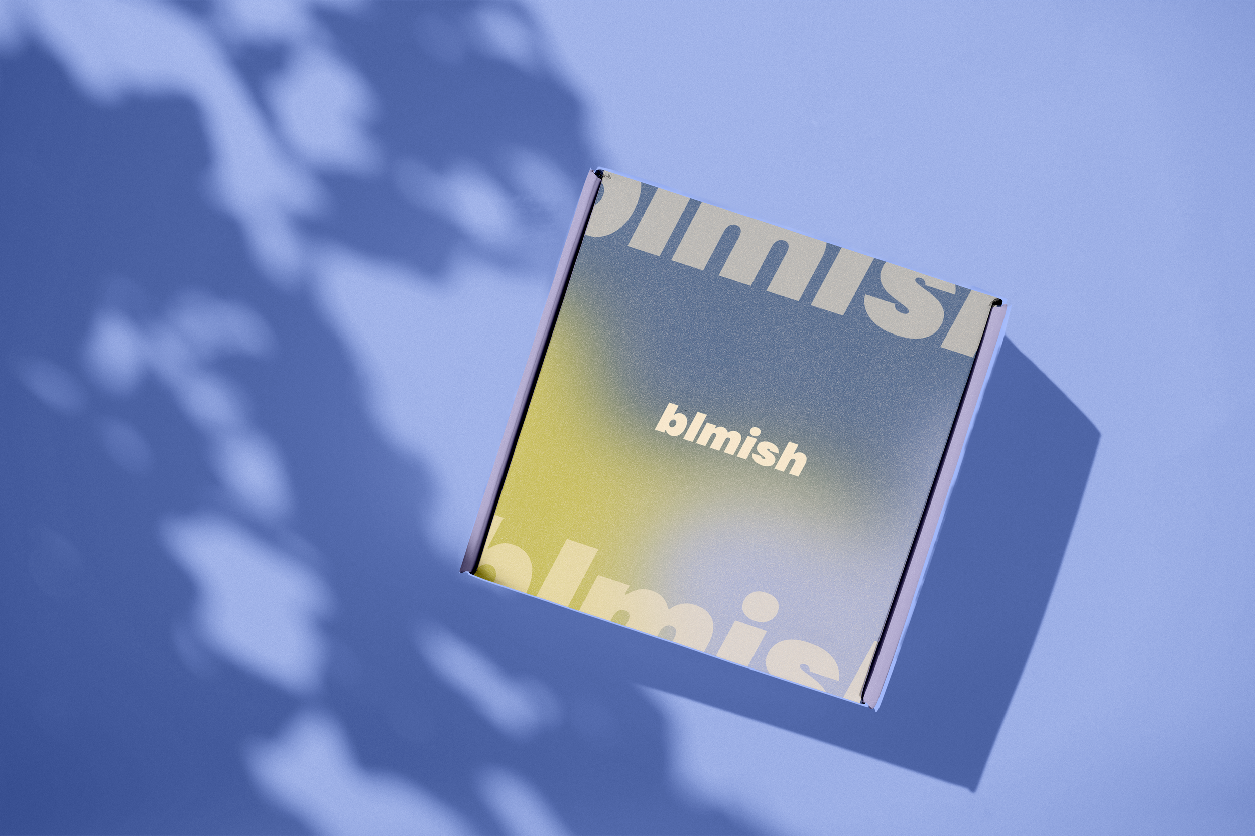
Packaging Design
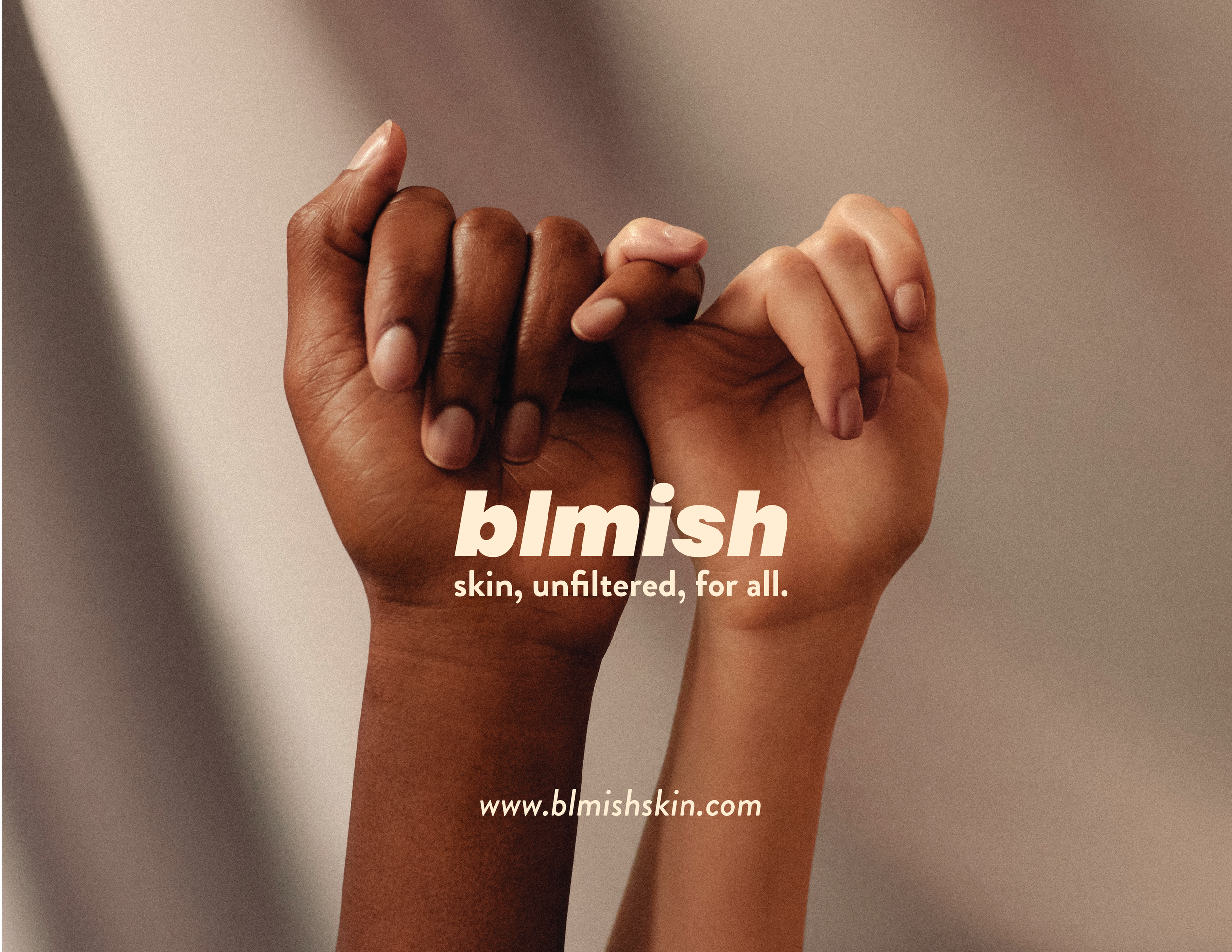
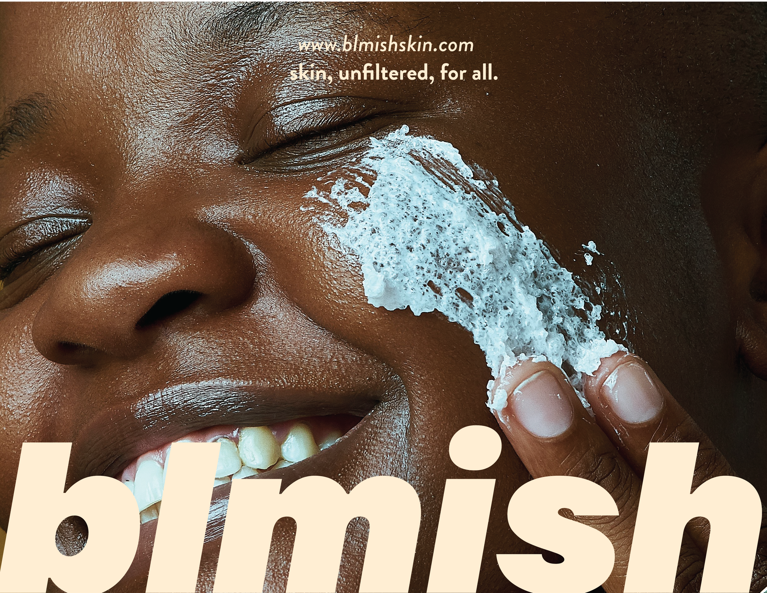
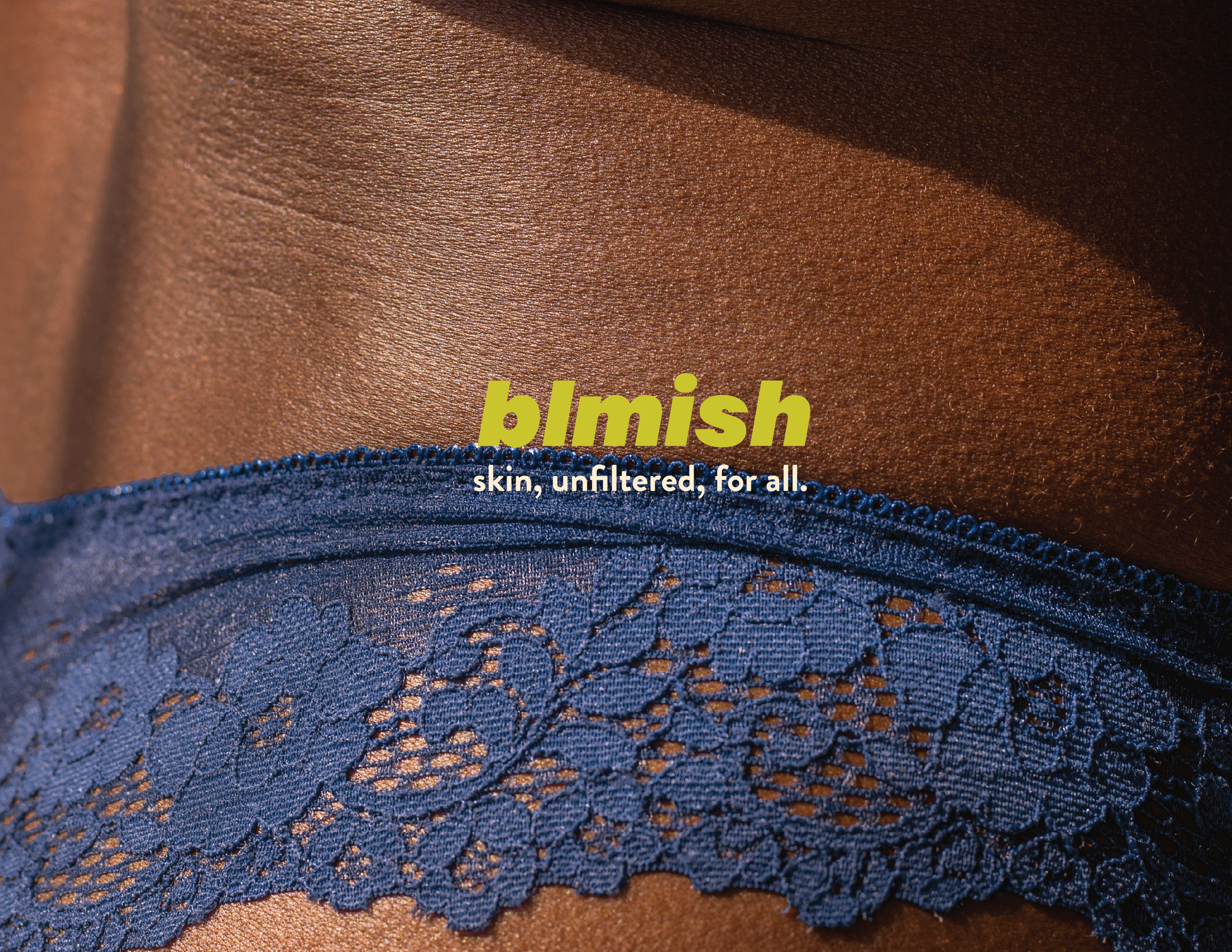
Skincare designed for real skin, every day.
Blmish is a modern skincare brand built to serve all skin tones and all skin types, with a deliberate focus on ensuring Black and POC skin feels considered, supported, and reflected. Rather than stating this outright, the brand expresses inclusivity through imagery, formulation philosophy, and language choices that prioritize comfort, balance, and everyday use.
Visually inspired by the elevated restraint of Rhode and guided by the ingredient-forward clarity and friendly tone of Good Molecules and Starface, Blmish lives at the intersection of premium calm and accessible care.
The Problem:
The skincare industry has positioned “universal” products as one-size-fits-all, while often formulating, marketing, and testing primarily with lighter skin tones in mind. As a result, Black and POC consumers are frequently left navigating products that are technically inclusive but practically misaligned — whether through formulas that irritate, sunscreens that leave a cast, or branding that never reflects them.
At the same time, many brands that center melanin-rich skin often rely on overt messaging, bold claims, or activist-forward branding that can feel limiting, trend-driven, or exclusionary in the opposite direction.
The Challenge
I was challenged with creating a skincare brand that genuinely works across skin tones and skin types. Feels elevated and design-forward, not clinical or corrective. Communicates inclusion without calling it out explicitly. Appeals to a younger, urban audience while remaining timeless and promising.
The Solution:
Blmish approaches inclusivity as a design principle and not as a tagline. Instead of highlighting who the brand is “for” in words, Blmish shows it through: Imagery, Product language, Formulations, and a restrained visual system
The result is a brand that feels welcoming without being performative, premium without being exclusive, and accessible.
Blmish doesn’t ask consumers to identify with a cause — it invites them into a skincare routine that respects their skin as it is.
Outcome:
Blmish establishes a skincare brand that feels seen without being labeled, premium without being disconnected, and inclusive without being performative. By focusing on thoughtful design, intentional language, and representation, the brand creates space for all skin — especially skin that has historically been overlooked.
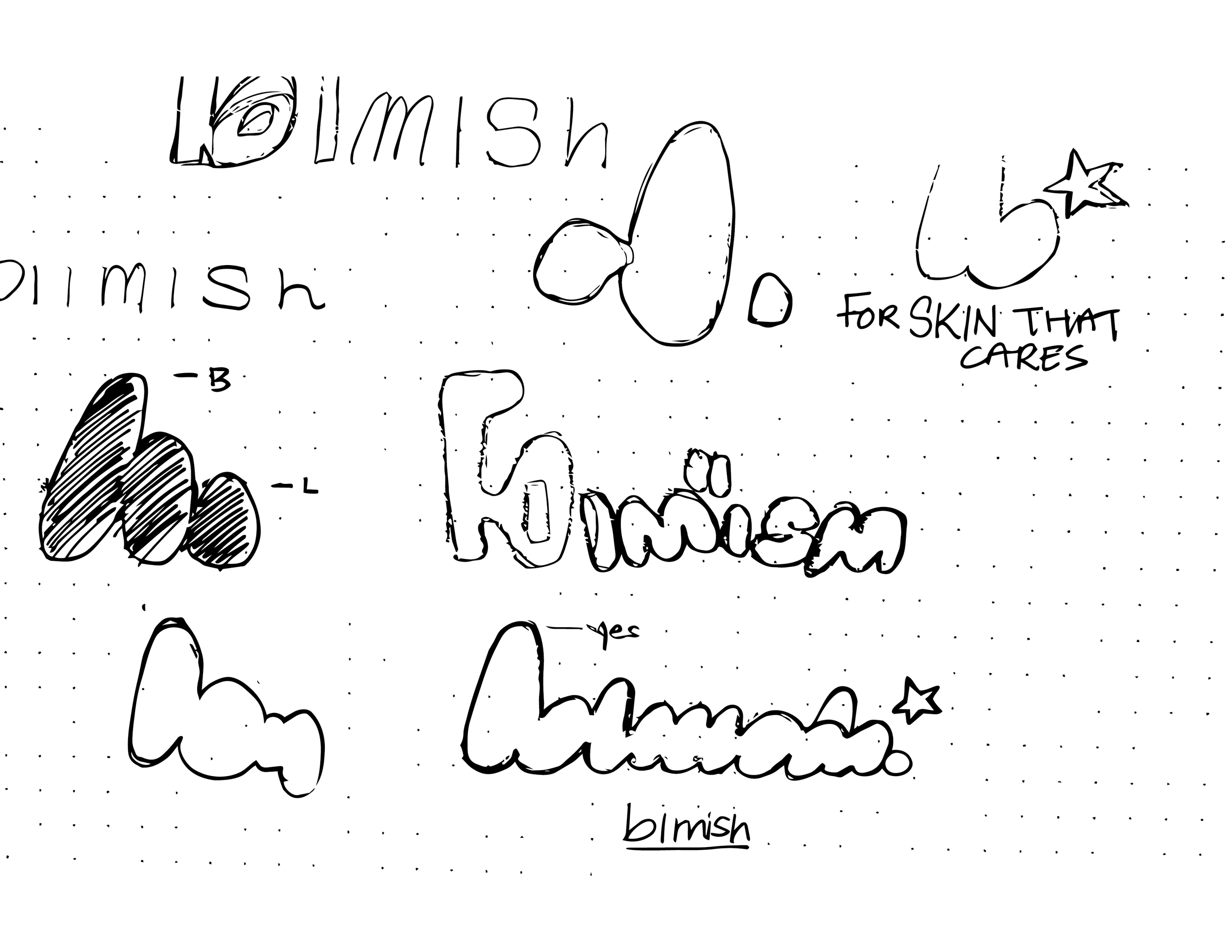
Naming & Visual Identity: Brand Principles
Blmish draws inspiration from the simplicity and restraint seen across modern skincare brands, resulting in a design system that speaks for itself. This approach is paired with an inclusive, ingredient-first philosophy that prioritizes accessibility and trust. By balancing minimalism with warmth through clear language and thoughtful visuals, the brand ensures all skin feels considered. The result is an elevated yet approachable identity designed to feel natural on shelves at retailers like Ulta or Target.

Secondary
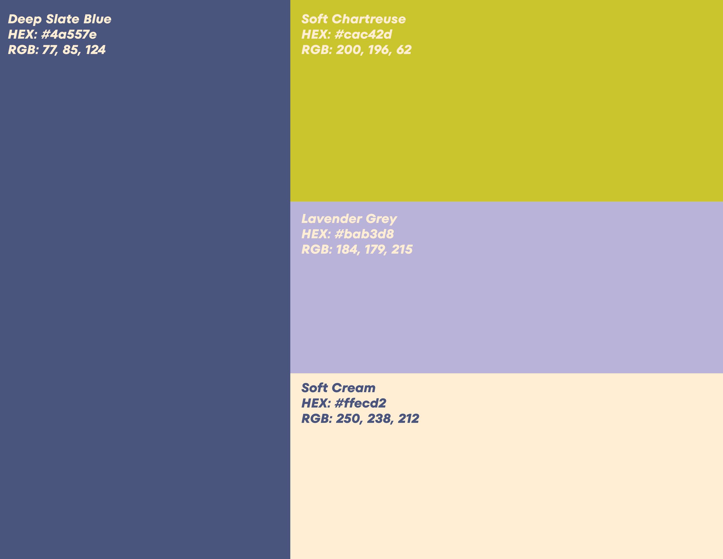
Color Pallette


Secondary
Typography
I wanted to keep the typography simple and elegant, while still feeling warm and inviting. My goal was to choose a font with a classic, timeless quality, which is why I selected New Kansas. The curvature of the “S” and “Y,” along with the distinctive terminals of each letter, adds a subtle personality to the brand. Asterisk Sans complements it perfectly—clean and understated, yet refined enough to elevate the overall identity.

The Blmish color palette balances experimental colors and depth to evoke a sense of calm, modernity, and inclusivity across all skin tones and genders. Soft neutrals and muted botanicals evoke a sense of comfort, approachability, and reliability, while deeper blues lend the brand confidence and longevity. Subtle accent tones add energy and youthfulness without overpowering the overall calm, reflecting a brand that feels thoughtful, current, and designed for daily consumption.
Drafting and Ideation
To further drive home the story of Sunday’s Roast, I created a set of illustrations that could be utilized throughout the brand.
Collateral
This is the final project of Blmish