❋
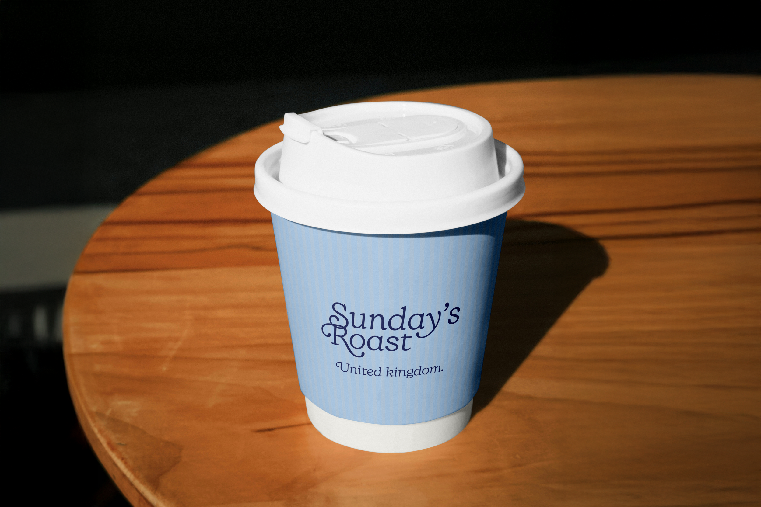
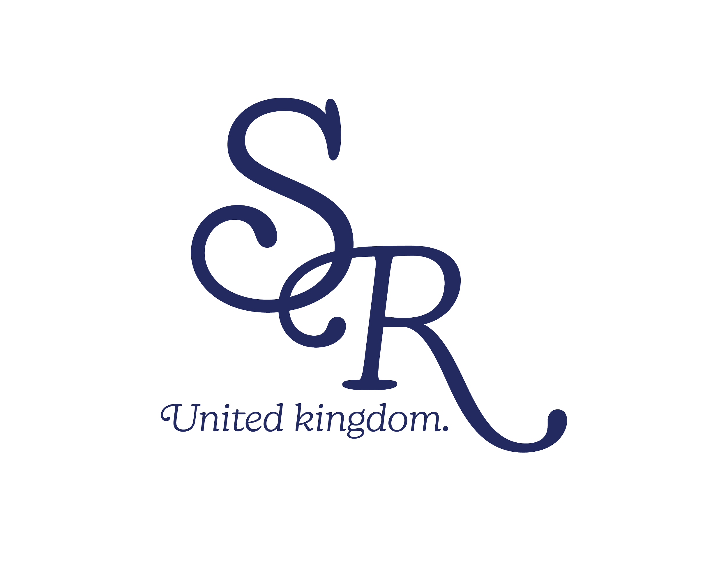
Sunday’s Roast Coffee
Sunday’s Roast
Conceptual Brand Identity
Client
Self-Initiated Project
Scope
Creative Direction
Brand Identity Design
Visual System Development
Print & Environmental Applications
Year
2025
Credits
Brand Design & Art Direction — Deja Brown
An unhurried approach to coffee
Overview
Sunday’s Roast is a conceptual coffee brand built around the idea of slowness as a luxury. In a culture dominated by urgency, productivity, and overstimulation, the brand repositions coffee as an emotional pause rather than a functional stimulant. The project explores how calm can be communicated not only through visual identity, but through often-overlooked, everyday touchpoints that quietly shape the customer experience.
The name Sunday’s Roast is inspired by the traditional English meal it references—an occasion rooted in ritual, togetherness, and unhurried time. Much like coffee, it represents a shared tradition, one that invites connection and presence through a simple, familiar act.
The Challenge
Modern coffee culture often equates value with speed, volume, and novelty. Cafés compete through louder branding, seasonal hype, and productivity-driven environments that encourage constant consumption. This creates a gap for a brand that: Respects time rather than accelerating it, Prioritises emotional comfort over efficiency, Feels considered, calm, and human
Concept
Sunday’s Roast exists to challenge urgency. The opportunity was to design a coffee brand that feels like permission to slow down — one that doesn’t rely on trends or excess, but instead builds trust through restraint, consistency, and quiet confidence.
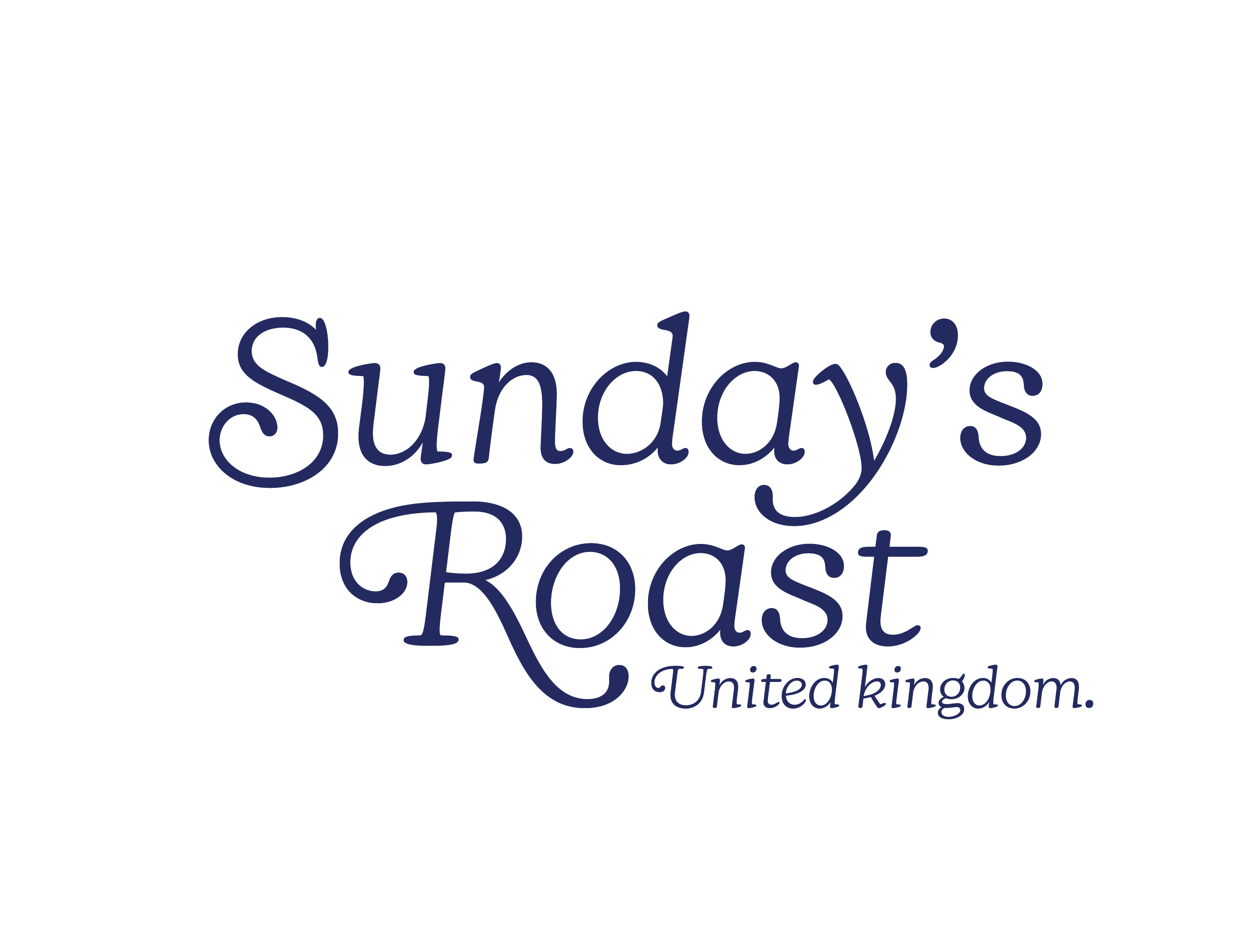
Naming & Visual Identity
Brand Principles
The identity is guided by a small set of principles: Slowness over speed, Comfort over cleverness, Consistency over novelty
These principles helped me make every visual decision.
Secondary
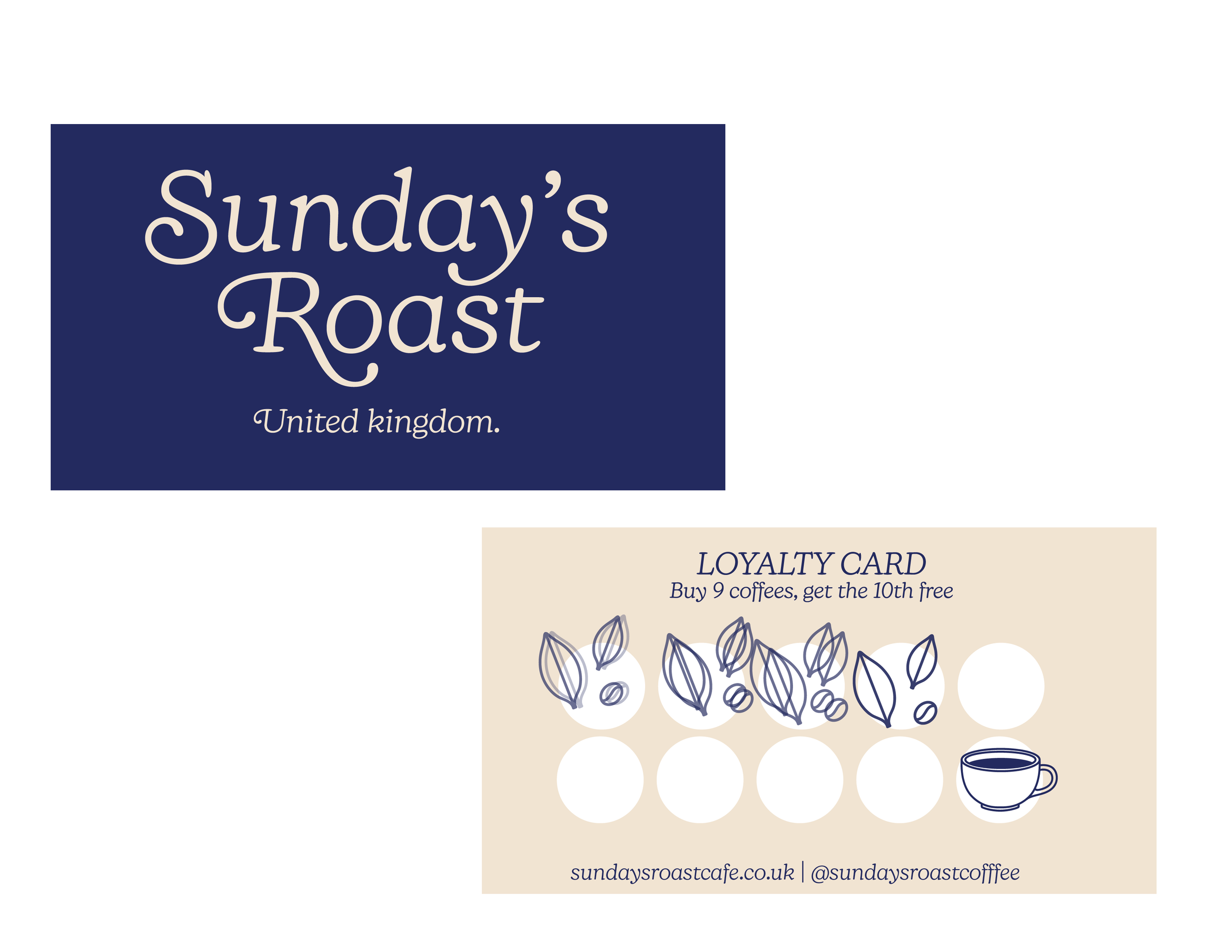
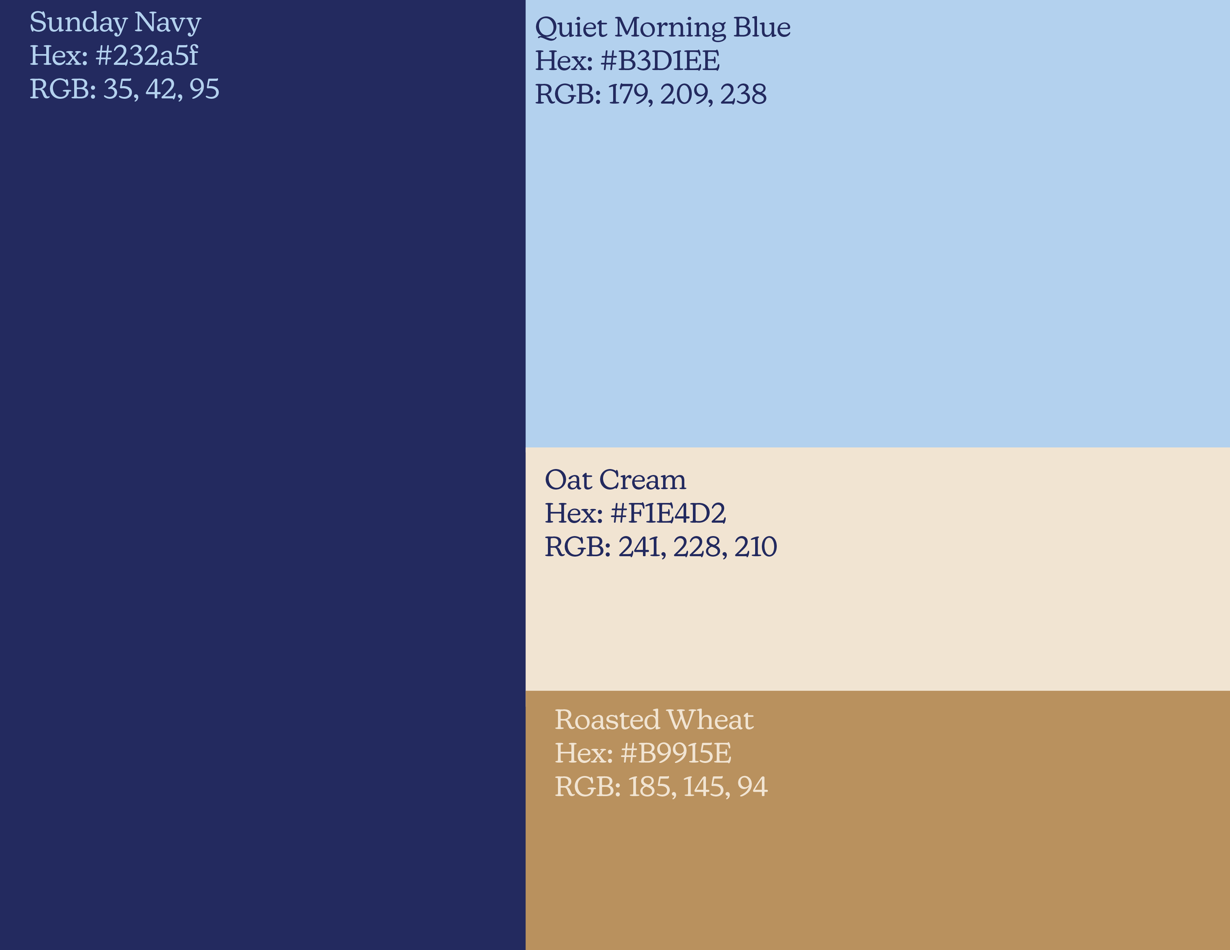
Color Pallette
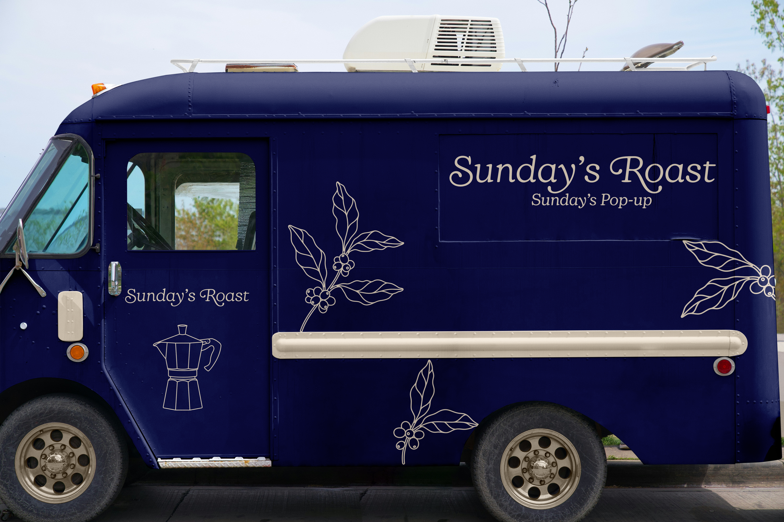
Brand Illustrations
To further drive home the story of Sunday’s Roast, I created a set of illustrations that could be utilized throughout the brand.
Secondary
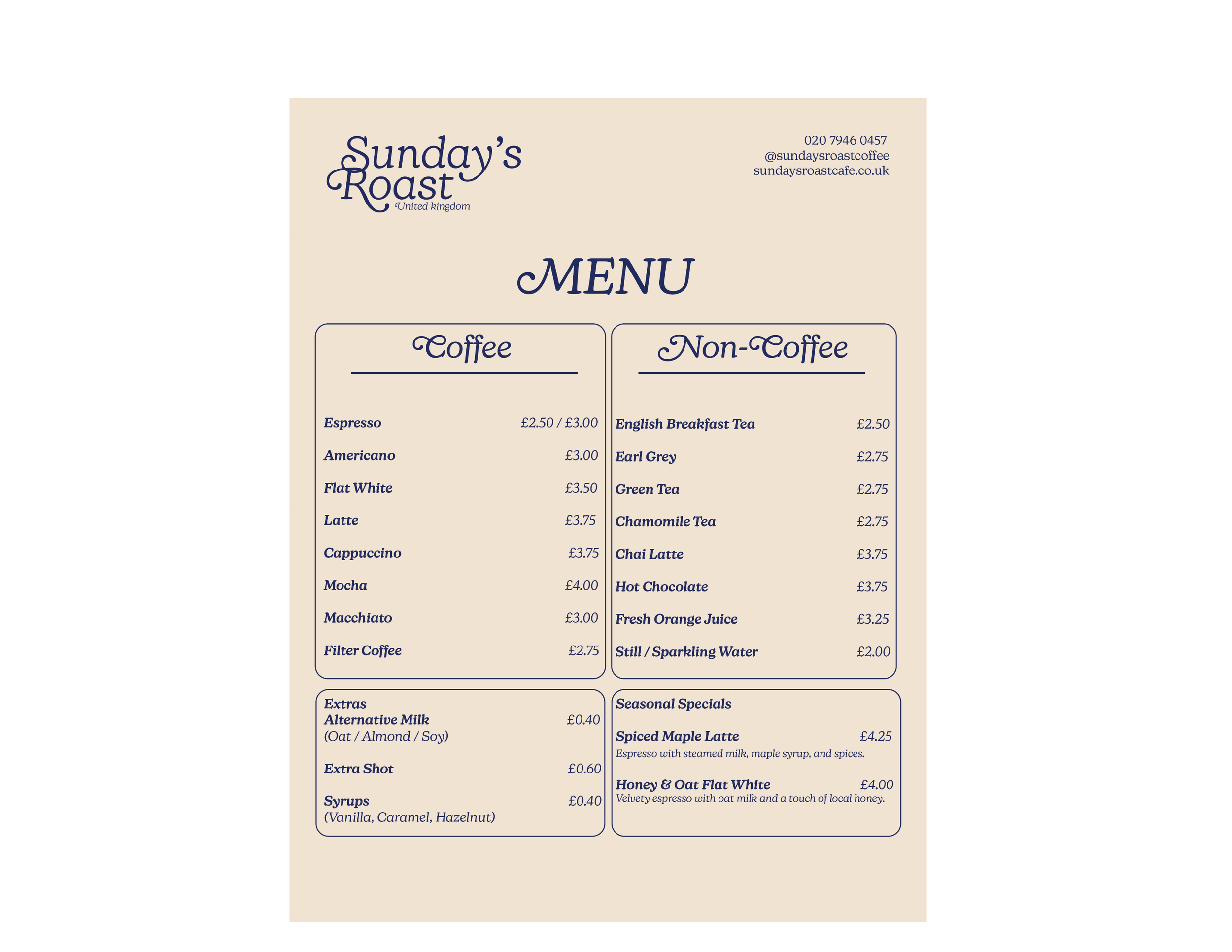
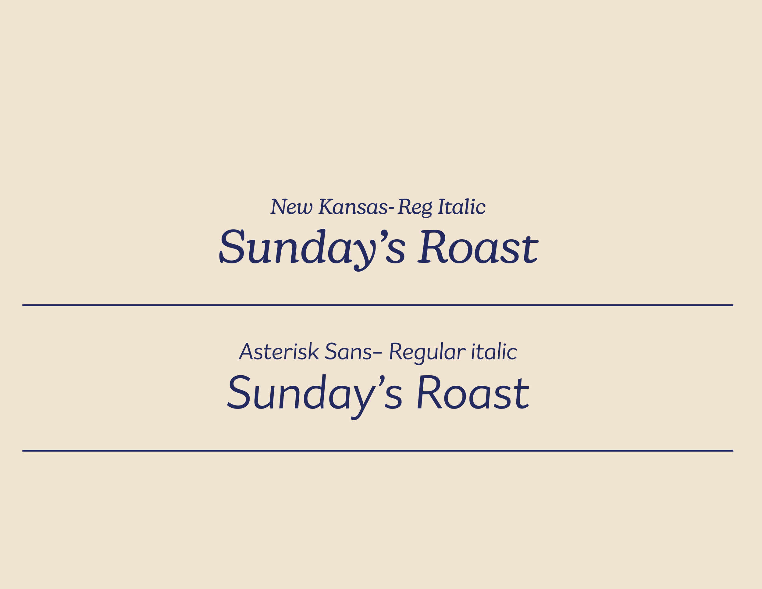
TYPOGRAPHY
I wanted to keep the typography simple and elegant, while still feeling warm and inviting. My goal was to choose a font with a classic, timeless quality, which is why I selected New Kansas. The curvature of the “S” and “Y,” along with the distinctive terminals of each letter, adds a subtle personality to the brand. Asterisk Sans complements it perfectly—clean and understated, yet refined enough to elevate the overall identity.

The inspiration for this palette draws from a sense of quiet royalty, reflecting the brand’s location in the United Kingdom while still evoking moments of stillness and calm. This is where the name Quiet Morning Blue comes from. The goal was not to overwhelm the brand with color, but rather to create a restrained, traditional palette in which each tone pairs harmoniously with the others—collectively reinforcing a feeling of softness, balance, and quiet presence.


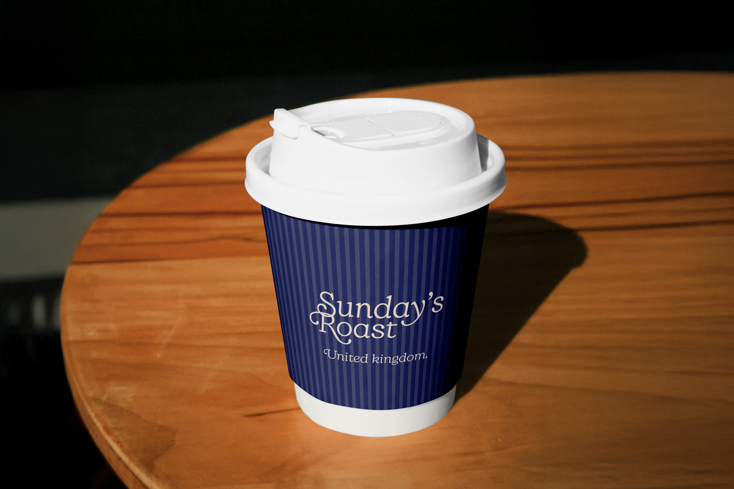
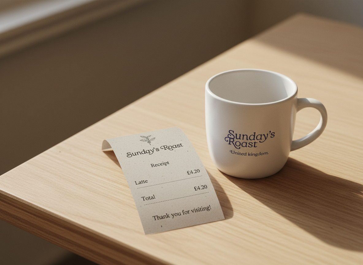
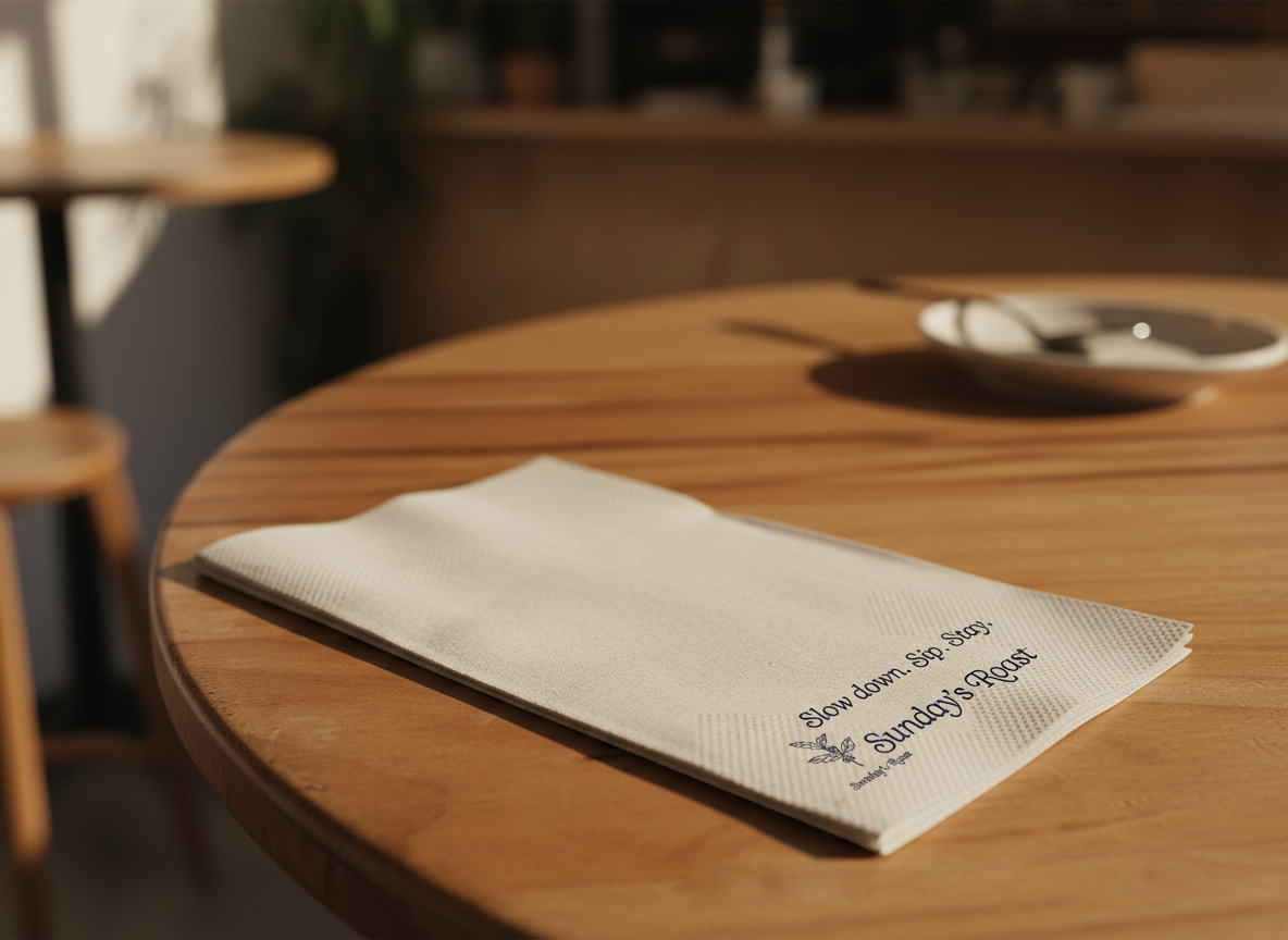
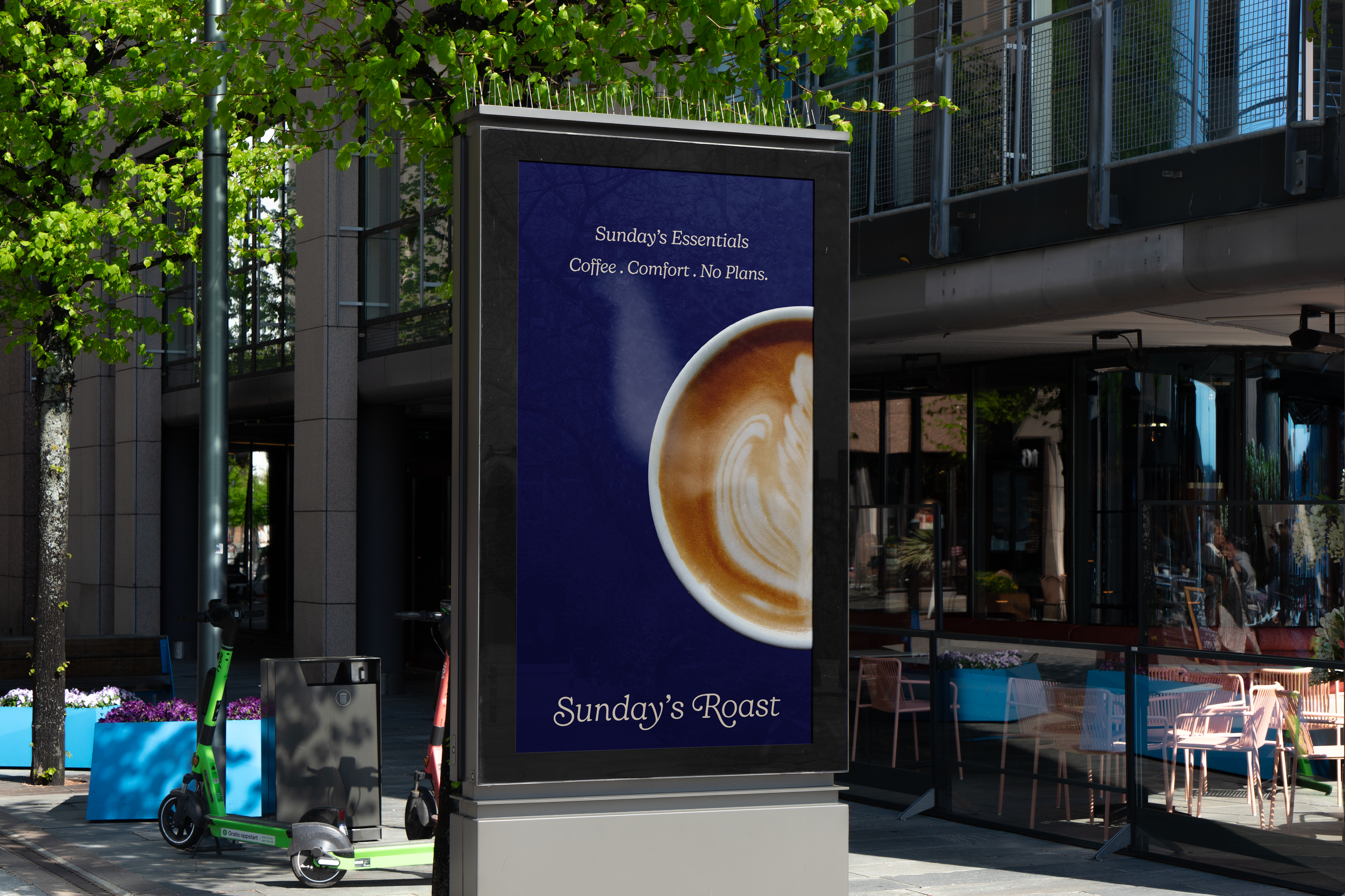
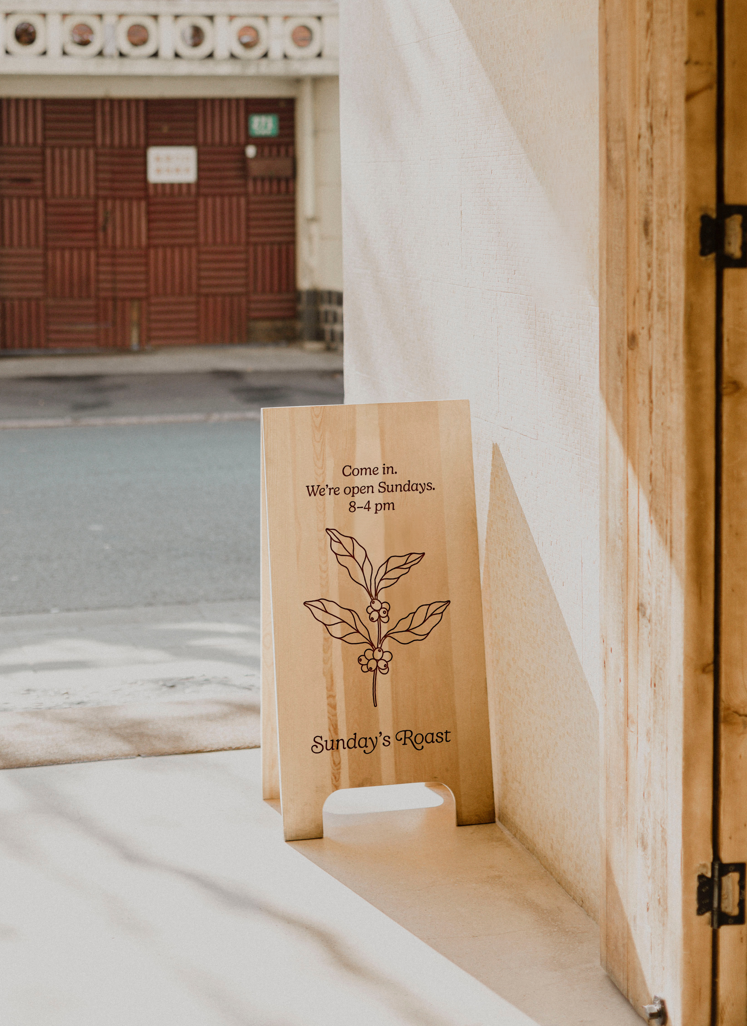
Collateral
This is the final project of Sunday’s Roast